UI/UX Modernization for National Climate Platform
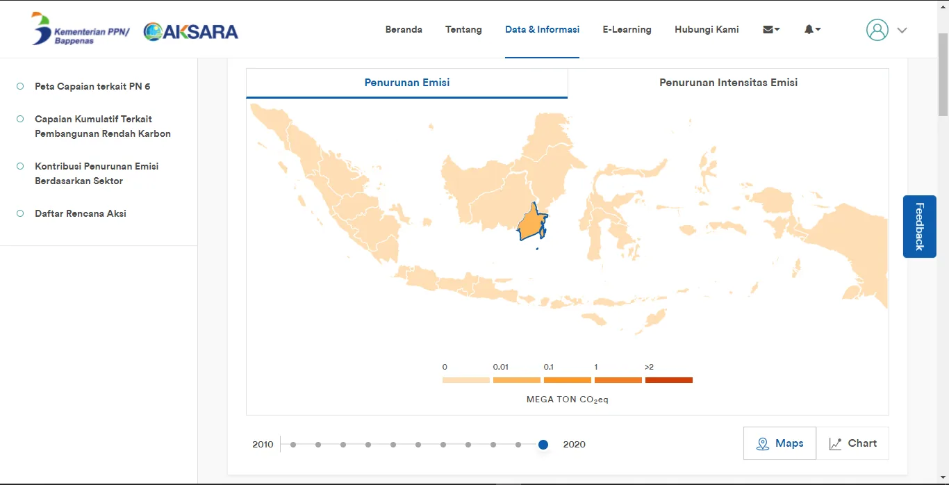
3D Visual Study AKSARA interface after the redesign
Figma / UI/UX Design Principles Jakarta, Indonesia (Bappenas)
Project Overview
Redesigned the UI/UX of the AKSARA WebGIS landing page to address usability challenges and modernize the user experience. Leveraging Figma, I conducted a visual audit of the legacy interface and engineered a new, intuitive design system. The overhaul transformed a text-heavy interface into a clean, dashboard-style layout with improved visual hierarchy, making complex climate data simulation tools accessible to non-technical stakeholders.
Outcomes & contributions
- Enhanced Usability: Re-architected the navigation flow, moving from a scattered top-menu structure to a consolidated sidebar for faster access to key modules.
- Visual Clarity: Introduced a coherent color scheme and card-based layout to distinguish between data visualization metrics and simulation controls clearly.
- Simulation Experience: Redesigned the "Simulation Scenario" controls (sliders and toggles) to be more interactive and user-friendly, reducing the learning curve for government officials.
- Client Satisfaction: Delivered a high-fidelity prototype that aligned perfectly with client objectives, bridging the gap between complex backend logic and frontend presentation.
Technology Stack
- Figma
- UI/UX Design Principles
- Data Visualization Design
- User Flow Analysis
System Documentation
1 / 2
Available for geospatial projects & technical consulting